How to Upgrade Your Website with Beautiful Card Style Widgets
If you have a website, you definitely need it to look good. There are many companies out there that offer design services and templates to help you design your website. However, you don't need any of that. You just need widgets!
What are Widgets?
Widgets are applications that can be embedded into your website and will provide you with an array of features. These widgets can be embedded into Wordpress, Squarespace, and Wix. There are just a few website builders, there’s a whole lot more! Here is a great article reviewing the Best Website Builders and an in-depth article explaining how to use Wordpress widgets.

Why use Widgets?
Widgets are great for adding content to your website without any coding. Why waste time coding when you can just copy and paste the provided code snippet?

Widgets can help showcase your content and improve the aesthetic of your website. For example, if you are selling products in Shopify, you can showcase your brand’s newest items in a wall view like this:

You can also display the latest headlines about your related industry news or display the most recent posts of your blog. Check out this sports feed:

By displaying the Wall view, you get a beautiful looking widget along with relevant content for your viewers. The wall widget has many customizations, so you can change it up however you want. Card styles help your wall widget look nicer and make your viewers want to read your content. Choose which style fits your needs without any coding!
Here are 4 card styles you can use today to upgrade your website.
Classic
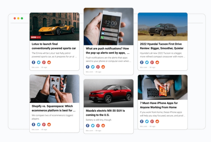
Classic is more of a traditional newspaper style which divides the card by title, image and post description. Each post is presented as a card. This style is great for getting information quickly without reading the whole article.
If you want to share the latest news with your subscribers, your website can have a wall like this. You can even include social sharing buttons and make your wall super engaging. You can also use this style to monitor your competitors by embedding the feed into a RSS reader. You will see the latest posts without going on their website.

Modern
The modern style brings the attention to the picture first. You can see what the post is about before you actually start reading it. Each card is styled with sleek curved corners and a bold title.
This design is good for users who place more emphasis on images than words. We all know, images are important because they help attract your attention. Yoast writes a great article explaining why images are important in blog posts. A great example of modern style cards is this food wall that highlights the latest food related content.

Gallery
Gallery is the most popular style. It’s great for showcasing content with minimal wording. This style brings all the attention to the image. The description only appears when you hover over the post. Use gallery style for product launches or show product news.
You can create very beautiful and attractive websites with this style. If you have a design business, you can upgrade your website by having a feed with the gallery style cards. You can show the latest news from Architectural Digest.

Pinterest is up there as being one of the most popular social media platforms. More than 400 million people use pinterest every month! That's why we created the Pinterest card style! This style lets your users browse, and discover your new content.
It’s definitely captivating and engaging your audience. If you are in the crypto scene, you can help your website stand out by including a crypto news wall just like this one.

For each card style, you can filter out content, customize the title, image and description settings. You can also choose background color, turn on social share icons, and sort your feed.
Start your RSS.app free trial and try these styles in your RSS Wall widgets!


